Create Your First Project
Start adding your projects to your portfolio. Click on "Manage Projects" to get started
Manchester District Orienteering Club
Project type
Logo and Brand design
Location
Manchester, United Kingdom
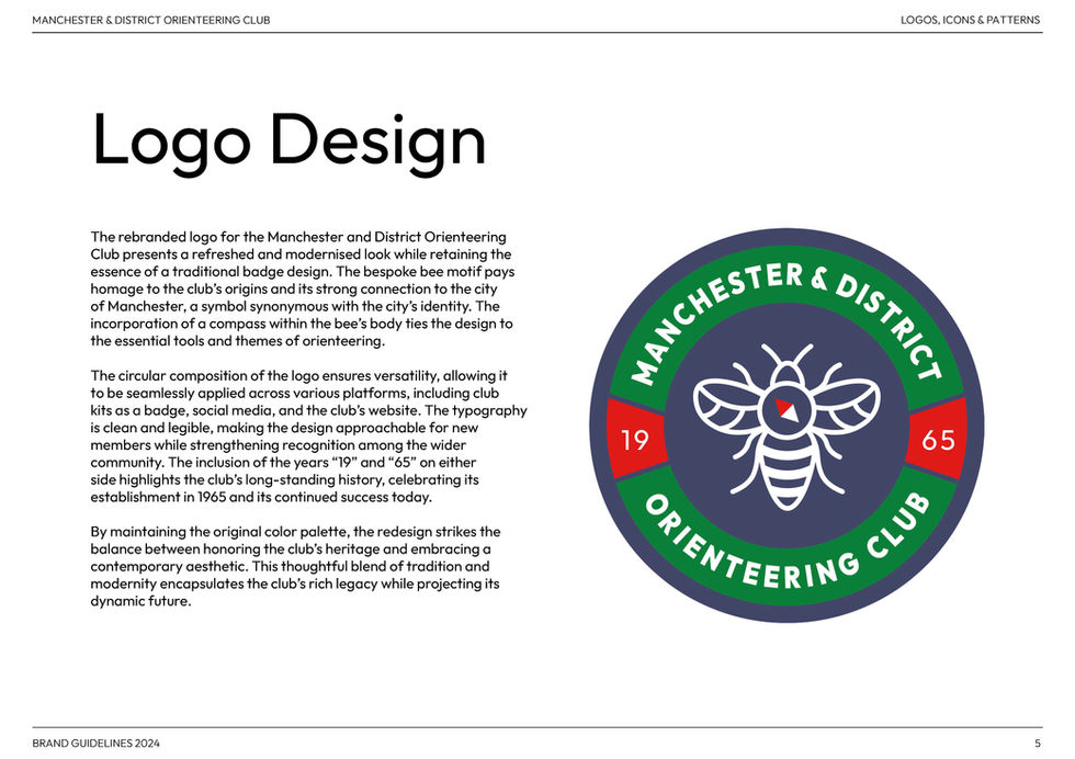
I worked on the rebranding of MDOC, one of the largest orienteering clubs in the North West of England, established in 1965. The project involved designing a refreshed logo that modernised the club’s visual identity while preserving its heritage and connection to Manchester.
Key contributions:
Concept Development: Designed a bespoke logo incorporating a bee motif—a symbol of Manchester—combined with a compass to represent orienteering.
Heritage Integration: Highlighted the club’s founding year, 1965, to celebrate its rich history and longstanding presence in the community.
Versatility: Created a circular composition adaptable across platforms, including club kits, social media, and the website.
Typography and Colour: Used clean, legible typography and retained the original colour palette to balance tradition and modernity.
This rebranding effort successfully encapsulates MDOC’s legacy while appealing to new members and reinforcing its identity as a welcoming and forward-looking club.


